- The Dev Chronicle
- Posts
- The Dev Chronicle #4
The Dev Chronicle #4
Your Ultimate Guide to Trending Web Development News, Tools, and Tips
The Dev Chronicle
July 29, 2023
🌟 Welcome to This Week's The Dev Chronicle! 🌟
Hello, there!
Welcome to our weekly dose of web development stories, tools, tutorials, and more. We're glad to have you with us. Let's dive in!
📌 Table of Contents
1. Weaving the Web: Top Stories in Development
2. Tool Time: Sharpen Your Web Crafting Skills
3. Blueprints for Success: Your Weekly Project Challenge
4. Picturing Code: Visual Breakdowns of Your Favorite Topics
🌐 Weaving the Web: Top Stories in Development
🛠️ Tool Time: Sharpen Your Web Crafting Skills
1. colorsinspo: discover great color palettes.
2. React Hot Toast: Add beautiful notifications to your react app.
3. Carbon: Create and share beautiful images of your source code.
🚀 Blueprints for Success: Your Weekly Project Challenge
This week, let's Create a Responsive Website Layout using CSS Flexbox. Check out the step-by-step guide on the requirements:
Objective:
Design a modern, responsive website layout with a header, main content section, sidebar, and footer using the CSS Flexbox layout model.
Details:
Header: The header should contain a logo on the left and a navigation menu on the right. Use flexbox properties to space these elements apart.
Main Section: The main content area should have two parts:
A sidebar on the left, containing a list of links, and
A main content area on the right for articles/posts.
When the viewport is below 768px, the sidebar should stack on top of the main content area.
Footer: The footer should contain three equal-width columns for different content like "About Us", "Contact Info", and "Social Links". The footer should stack the columns vertically when the viewport is less than 768px.
Instructions:
Set up your HTML structure. Use semantic HTML5 elements (
<header></header>,<main></main>,<aside></aside>,<footer></footer>).Use CSS to style your page. For colors and fonts, feel free to use your creativity.
Implement Flexbox in your CSS to control the layout. You should use properties like
display: flex,flex-direction,justify-content,align-items, andflex-wrap.Remember to make your design responsive. You can use media queries to change the layout for smaller screens.
Bonus: Use some CSS transitions or animations for a better user experience. For instance, you could animate the
hoverstate of your navigation links.
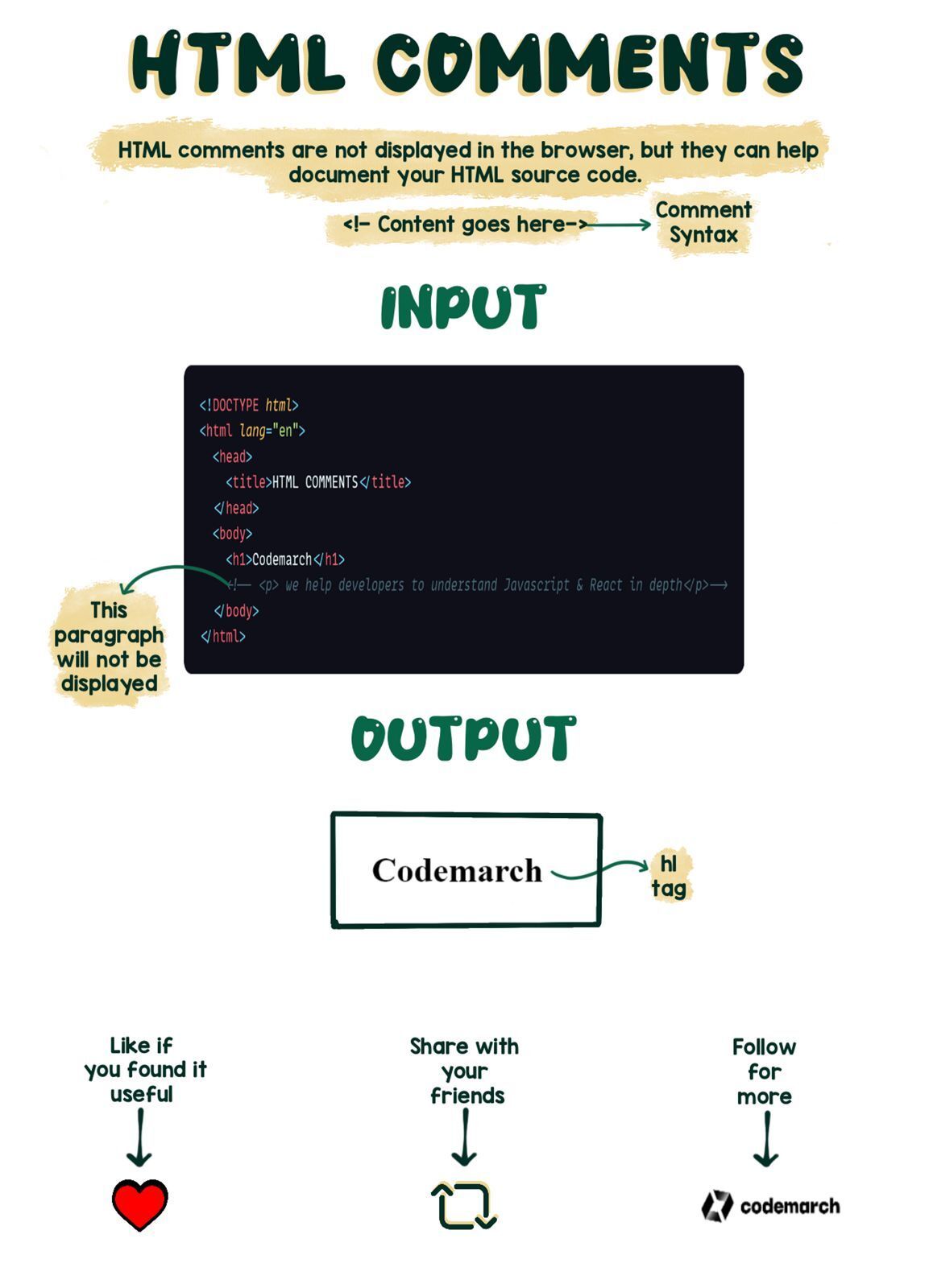
🎨 Picturing Code: Visual Breakdowns of Your Favourite Topics
And that's a wrap for this week! As always, we appreciate your feedback. Let's keep learning, exploring, and coding together. See you next week! 😃
Happy coding,